As with most things these days, when it comes to Twitter clients for Mac OSX, you have a lot of options. Apps, widgets, websites – methods for answering the simple question “What are you doing?” are numerous. How do you know which tools are tops, or which ones will best suit your particular needs? You certainly want to be tweeting to your fullest potential, so how do you choose? Here’s a look at many of the major applications, their pros and cons, and a bit of info that just might help you get a bearing on what’s what.
Be prepared, you might just find the perfect tool to aid your quest to tell the world every useless thing you’re doing.
Twitterrific
Price: Free (ad supported – once an hour)
$14.95 (licensed version)
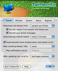
No doubt you’ve seen some of your fellow Tweeters using this app, as it’s one of the more popular options available for OSX. It has a very unadorned but well-designed interface with a partially transparent background so you never entirely cover up what else you may be working on. Twitterific features Growl integration and AppleScript support, which is joyous for those who use programs like iChat or Skype, as it’s able to change your status with your tweets. (So you’d better make sure to actually answer the ‘What Are You Doing?’ question!) It shows direct messages and @ replies as well, giving you basically all the features of the web application in a bite-sized handy dandy variety.
On the downside, the fastest refresh interval is three minutes. Three whole minutes! For some, that may be fine – but for those who have hundreds or thousands of followers, a lot of important stuff can happen in three minutes. Some will also consider the fact Twitterrific is ad-supported if you want it for free as a negative fact, but hey – beggars can’t be choosers. Deal with an ad every now and then. You probably won’t even notice.
Pros:
-Nice simple interface.
-@replies and DMs inline
-AppleScript/Growl support
Cons:
-Three minute update interval might as well be a billion years
-Get it here: http://iconfactory.com/software/twitterrific
Twidget
Price: Free
This is a simple dashboard widget for those who want to keep their Tweeting off the main screen. It’s a straightforward, no-thrills blue box. It allows you to update your status and keep track of other people’s discussions, but that’s about it. There is no keeping track of your followers, or who you are following. You also can’t look at what you’ve said in the past, who you’ve messaged, or really anything that you’ve done. It’s basically only good for updating your status, and not caring beyond that point.
That said, it’s easy to use – and refreshes every minute, which is a pretty decent interval. But for most, that simply isn’t enough.
Pros:
-Couldn’t be any simpler
-Free as a bird
-Nice 1 minute refresh time
Cons:
-Doesn’t do most of the things that make Twitter useful
Get it here: http://twidget.en.softonic.com/mac
Twhirl
Price: Free
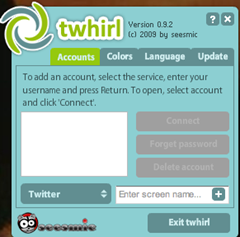
Another heavy hitter in the popularity contest, this guy actually runs on OSX and Windows. It is built using Adobe AIR, and therefore offers a lot of features and multiple platform support. There may actually be too many features…
Twhirl is designed to work for Twitter, laconi.ca, Friendfeed and Seesmic, in case for some reason you are using those other services. It also integrates with TwitPic and Tweetscan, as well as supporting URL shortening services like bit.ly, which is a super big plus. If that weren’t enough, it can also cross-post to Digg, Facebook, Myspace, Pownce, Jaiku and can use Twitter Search, saves your past searches, and shows trending topics. Whew.
It has some nice aspects. For instance, when you look at your Followers, it doesn’t just give you their name and icon, it gives you their mini biography and link, too. It has a built-in notification system so you never miss a tweet. It’s even got a spell checker, and allows you to change its appearance. Too bad it can’t change the fact that it’s ugly, very complicated to look at, and bulkier than Wilfred Brimley’s mustache. The first time I opened it, I had no motivation to learn what the bajillion buttons are good for. Not when there are simpler programs out there. Sure, it does a lot… but I almost don’t care.
It also lacks a lot of Apple-ness because it is a cross-platform app – such as no Growl support, no Core Animation. On top of all that, it’s a beast of a RAM hog.
Pros:
-It sure does a lot. Integration with nearly everything.
-Cross-service posting
-Free
Cons:
-Design is terrible and intimidating
-Adobe AIR makes it more a PC tool than an OSX tool
-RAM suckage
Get it here: http://www.twhirl.org/
Twitterpod
Price: Free
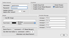
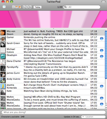
This bad boy looks boring, but it only starts out that way. It doesn’t have to stay dull. It is customizable to its nougaty center, like a spring tree waiting for its blossoming buds. Ok, for real – Look at the before and after pics, where we put the technogog logo behind the tweets. Sure, it looks terrible, but that’s not the point – the point is you can do it. With the right image, it’d be a nice touch and offer unlimited personalization. You can also change font colors, alter the transparency of the window, and set up automatic tweet messages. What’s that mean? Say my personal catchphrase is “Well booger my sugar!” I can set the F3 button to automatically tweet that phrase with one push. Fancy.
Additionally fancy is the pop-out browser. Any tweet that contains a URL will pop out a bar on the side, showing you that URL. This is instead of turning the in-tweet URL into a clickable link, though, so if you want to look at it in your regular browser, it makes that more complicated.
Twitterpod also has unique view options. Clicking the ‘URL’ button at the top will show you all the tweets you and your followers have made that have a URL. ‘Me’ shows you just your tweets, and ‘All’ shows you, well, all tweets. All while random tweets fly by the top of the screen…. Oh, and hopping on the bandwagon, it can update your iChat status. The device also works with Growl, because people love their notifications. Finally, it has a message store capability so you can easily search logs.
Pros:
-Cool customization
-Unique tweet views, like URL and Me
-FREE is always the best price
-Message store capability
Cons:
-Normally a plain interface
Get it here: http://drikin.com/twitterpod/
Tweetie
Price: Free (ad supported)
$14.95 (licensed version, until May 4, 2009)
$19.95 (licensed version)
Tweetie is the new big kid in town. Just released this past week, the Twitter world was bursting from their trousers with expectancy for this ported iPhone application. By far the most successful iPhone app, the Twitter masses were eager to see how it would transmute its splendor onto the OSX desktop.
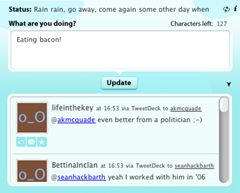
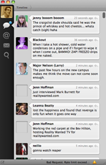
It’s streamlined, it’s got the essential features, and it knows it’s boss. It looks similar to an iChat window, and the software makes it easy to find and understand all the tools. The bar on the left separates the views: all tweets, @ replies, direct messages, and search. In the browser, tweets directed at you with an @reply will show blue, allowing you to easily separate them from the crowd. You can double-click an @reply and it will show you the entire conversation to date – something no other program does. The reply arrow is right there on the side of each tweet, and it’s all just so slick. Hash tags also become clickable, making searches easy. It’s minimalistic – the opposite of Twhirl. Developer atebits calls it “suspiciously simple software.”
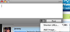
Tweetie lets you shorten URLs with your choice of shortener. It also integrates with the beloved photo tools, like TwitPic, yFrog, and Posterous. Better yet, you can drag an image file into the tweet area and Tweetie will upload it to one of the services for you, create the link, and put it in your tweet. Now that is smart.
Looking at one person’s profile and timeline (done by double-clicking them), you can see all their info, @replies directed at them, get a Google Map of their location, and be taken to their homepage. You can even use Tweetie to handle multiple Twitter accounts, and select which account to view or tweet from.
That’s a lot of features. But one thing you may think while looking at the software is “Where do I tweet?” Good question. See that tiny little icon in the bottom left corner? You have to click that, and it brings up a separate window where you update your status. I flat out hate this. You can also use Command-N, but come on…
Overall, though, this piece is real sexy.
Pros:
-Beautiful, streamlined design
-Does just about everything you need it to
-Implementation of tools like URL shortening & photo posting are fabulous
-@reply conversation viewing
-Can be free if you don’t mind a once-per-hour ad
Cons:
-Terrible placement for tweet window, feels disjointed
Get it here: http://www.atebits.com/tweetie-mac/
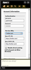
Spaz
Price: Free
“Your Special Twitter Friend” – This one is for Twitter and identi.ca. Like Twhirl, this uses the Adobe AIR platform, thus making it perform on Mac, PC and Linux, and thus making it use more RAM than is necessary.
What’s special? You can upload your own CSS to customize it, that’s pretty unique. It includes a Wilhelm Scream as a notification, which is pretty hilarious. You can select its refresh frequency, which is a nice touch. But how does it handle Twitter?
I enjoy this program fairly well. Each tweet comes up on its own line, with the reply, favorite and message tools right there waiting. Double-clicking a person’s profile pic brings up their Twitter page in a browser, which sort of sucks. The search box above the timeline only filters the timeline below it and isn’t an actual search feature. Using the magnifying glass above does that.
New tweets come in and a sound plays – the new tweets pop up in their own little bubble for a few seconds to draw your attention. It does shorten URLs, it does upload images for you, it doesn’t do your laundry. It also doesn’t allow you to follow people from within the program, which is beat like a cheap steak.
Like Twhirl, the Adobe AIR interface makes sure there’s no Growl or Core Animation support. There is nothing truly Mac about it, which will turn away many Mac users.
Pros:
-Simple, easy to use
-Good layout and design
-Focuses on communicating with all the necessary tools
Cons:
-Not truly mac – Adobe AIR platform
-No way to follow others
-Opens profiles in web browser
Get it here: http://funkatron.com/spaz#download
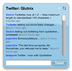
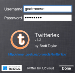
Twitterlex
Price: Free
This is a cheap little OSX dashboard widget that has even less thrills than the overly simplistic Twidget. It’s a blue box, a 30-tweet timeline, and a place to type your tweet.
Or so I hear. Most of the time, mine is blank like the picture you see. Installed on my machine for months, I very rarely get it to actually show anything.
The widget is supposed to have Growl support and update every 60 seconds when visible, 5 minutes when hidden. These values can’t be changed, as the widget offers no customization at all. Even if it worked well, it simply wouldn’t do much.
Pros:
-Ummm… simple?
Cons:
-Everything else.
TweetDeck
Price: Free
Oh my, it’s Adobe AIR yet again! Working on all operating systems, this is yet another application that will lack Mac sexiness. Despite that, it is very unique from the other two AIR applications we’ve seen, both in presentation and function. It is also the most widely used Twitter application for OSX.
This bad boy is a browser. It’s pretty humongous, and to some may refute the purpose of using an application. The basic window divides tweets into three categories: All Friends (all tweets), Replies (all @ comments directed at you) and Direct Messages. When a new tweet comes in, a sound plays, and a little popup chirps at you from the corner to force your eyes at the app and tell you in which category the message falls (general tweet, DM, @, etc.). You can clear the tweet windows, shuffle them around, and apply filters to the contents. There are also lots of great search tools. Unfortunately, like other AIR applications, it’s a RAM-hungry gigantor.
See that big bar of buttons along the top? To tweet, you click the first one and enter your message. It has a built-in shortener, built-in TwitPic sync, and can update your Facebook status. The software also syncs with StockTwits and 12 Seconds TV.
One cool feature is the ability to categorize your followers into groups. You know, for those of who you feel the need to do things like that. It automatically updates its stuff every minute, which is a good frequency.
Pros:
-Lots of good tools – everything you need and more.
-Unique layout, easy to follow
Cons:
-Pretty huge interface
-Memory consumer
Get it here: http://www.tweetdeck.com/beta/
Mac Lounge
Price: Free (beta)
Mac Lounge is another brand-new Twitter client for OSX. Ported from an iPhone app, this software is so new it’s still in beta at the time of this writing. This classes it in the tiny sector of apps that are both phone and desktop-based. It plans to offer syncing between the two products, which will be great for iPhone users.
The software runs natively on OSX, which is a big plus. While it doesn’t have a maximum size, it does have a minimum size, so some 13” MacBook users might find their screens a little cramped if they’re not using Spaces.
Clicking a tweet brings down a window that shows you all sorts of info about the tweeter – access to all their tweets, their number of followers, followees, website, profile and more. This is a really elegant touch to the app. The left-hand side offers all the navigation and filtering of what you’re looking at on the right, and what’s what should be fairly obvious by the tabs.
It supports multiple accounts, does all the standard extra functions, and thank God – allows you to type your tweets on the screen at all times. While the developer still admits there are a lot of bugs to work out and things to smooth before the real launch date, this beta version is very promising. It doesn’t revolutionize what we expect from Twitter applications in any way, but it is an amalgam of a lot of the great features and intuitive design that is popular in many existing leaders.
Pros:
-Great design and control
-Pop-down window under tweets
Cons:
-Sluggish and slow, but it’s still in beta
Get it here: http://loungeapp.com/mac/
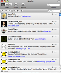
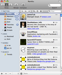
Nambu
Price: Free
Finally, we have one more brand-new Twitter client that is still in beta mode. It says you can download and use it for free, forever, so the implication that this will remain free software is there. Like many others, this is for Twitter, identi.ca and laconi.ca.
A big feature Nambu is advertising is its low memory consumption. Use it all day, and your system isn’t supposed to get bogged down. It plays off of TweetDeck’s strengths, while trying to improve on the drawbacks of the system – memory being one. Nambu is not created using Adobe AIR, so it has that going for it right off. It also offers three viewing options. One is similar to TweetDeck, with the multiple-column format. You can even add more columns if you wish. Another view uses a sidebar menu, and another is small and self-contained. This provides great visual choices and usage flexibility.
It supports grouping of followers, auto-completing of names, multiple accounts, URL shortening (defaults to tr.im, because Nambu created it). It even allows you to translate non-English tweets to English with one keystroke. It supports uploading photos, and double-clicking a tweet automatically sets up an @ reply.
The fallback is that it doesn’t support integration with a lot of other services like StockTwits or Facebook. However, FriendFeed, identi.ca and Ping.fm support is in the works. Remember, this is still in beta – lots can change.
One other special element is that Nambu automatically threads your conversations. Overall, Nambu looks promising for those who use TweetDeck but get frustrated by the memory usage and appearance of the software.
Pros:
-Conversation threading
-Multiple view options
-English translation
Cons:
-Not as much integration with outside services as competitors
Get it here: http://www.nambu.com/
NatsuLion
Price: Free
This Leopard-only Twitter client has an iPhone counterpart. The software’s goals are listed as “Be simple, feature icons, and be easy to use for light Twitter users.” Therefore, it is designed with the novice Tweeter in mind, and may not support all the fancy requirements of the 100-times-per-day Tweeter.
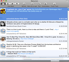
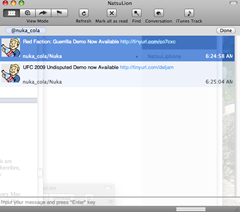
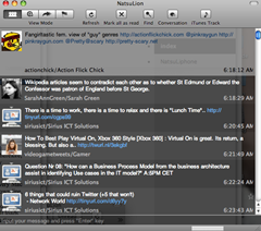
Opening it up, it feels like something familiar. Being Leopard-specific, it has a very Mac look and feel, which will suit its simplicity goal. It shows you each tweet on its own line, and has a bar across the bottom to put your own tweets. The filters at the top are for @replies, DMs, All tweets, and an interesting feature – Unread tweets. The ‘Find’ feature only filters the tweets from those you follow, and isn’t an actual search. It loads profiles in the web, as double-clicking someone begins an @reply. The Conversation button threads conversations for you, which is a more complex feature of this simple tool. It’ll also update your Adium status.
It can have as quick as a 30 second interval refresh, which is very fast. There are two color schemes – dark or light grey – and you can alter the window transparency. It also has Growl support.
There is no way to follow people. That requires calling the browser. There is no way to look at all your followers. Again, browser. There is also no grouping and little other customization. No shortening, no linking with other softwares, etc. It is a very barebones piece of software, obviously designed for light Twitter users as it claims. People who don’t use the service much won’t mind they have to rely on the browser for lots of things, because they won’t be doing it very much.
Pros:
-30 second refresh interval with lots of interval settings
-Conversation button
-Simple to use for lightweight users
Cons:
-Simple to use for lightweight users
-Not a unique program
-No grouping, following, etc.
Get it here: http://www.natsulion.org/
Syrinx
Price: Free
This is a Cocoa-coded gadget designed for Leopard. It is basic like NatsuLion, but offers more customization options that may or may not make it more useful for busier Tweeters.
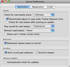
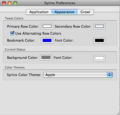
Three minutes is the shortest refresh interval. You can change the background colors of the tweets manually, or there are color themes you can choose: Apple, Dagobah, Hoth, Tatooine and Yavin. Har har. Settings for Growl support are also available, and it has built-in color and theme support.
There are few choices on the actual application. Refresh, Pause, Bookmark Newest, Home and Friends. The first few are self-explanatory. Home calls up the web. Clicking Friends will likely give you the spinning wheel for a while as it populates a list of your followers so that you can DM them or otherwise get in touch. The Bookmark Newest button puts a little flag at the top tweet, so as new ones pour in, you’ll know where you left off and can play catch-up. It will also thread your conversations for you, but following a new person still requires you to go to the web.
What we’re left with is another simple program that lacks the technicalities of the larger programs. It is simple for those who tweet a little, but probably insignificant for those who tweet a lot.
Pros:
-Simple
-Customizable color schemes with Star Wars themes
-Bookmark Newest
Cons:
-Lacks intuitiveness
-Too simple for the engaged Tweeter
Get it here: http://www.macupdate.com/info.php/id/28373/syrinx
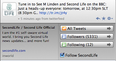
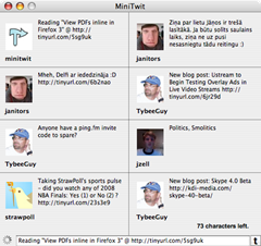
MiniTwit
Price: Free
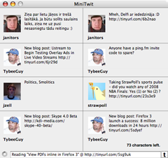
This little program is so small. It can be downloaded from the Apple Internet Utilities page for free.
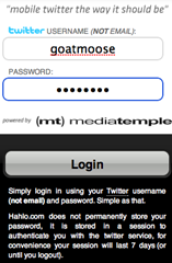
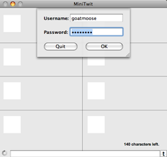
It posts tweets, and shows you tweets. That’s literally all. It beeps every time you post, which is annoying, and you can’t turn it off. If you are looking for something with little interference, you’ve found a godsend. It puts out your tweet and leaves you alone. If you want a tool that will actually do things, you’re out of luck. This is all assuming you can get it to actually log you in – which I couldn’t – hence the boxed screenshots.
The program will use TinyURL to shorten URLs for you. Any other functions relay you to the web. There really isn’t much else to say – it just doesn’t do anything else.
Pros:
-Couldn’t be simpler
Cons:
-Only good for the basic use of Twitter
Get it here: http://www.apple.com/downloads/macosx/internet_utilities/minitwit.html
Tweek
Price: Free (15 day trial)
Price: $5.00 (license)
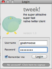
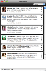
“The Twitter client your mom warned you about.” The self-proclaimed “Newest, hottest, most awesomest to the max Twitter client on you block” is here. Thank God.
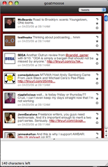
It has the common presentation – a large column of tweets with your typing box at the bottom. Clicking a person’s icon brings up a nice little box with their profile info, ways to message them, a button to follow them, and a link to their site. Hash tags get turned into links but don’t seem to do anything when you click them. And naturally, Tweek lets you filter what you’re seeing by all tweets, @replies or DMs. The one-click RT is also a nice touch.
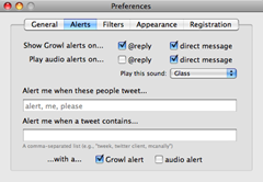
It boasts everywhere from a 1 minute to 1 hour refresh interval, has Growl support, can play an audio alert when particular people tweet (awesome) or when a tweet contains certain words (double awesome), allows you to filter tweets, choose from a selection of color presets, delete your own tweets from your visible timeline, and all around is a pretty decent app. It is coded in Cocoa, so it’s good with memory and won’t eat it all up like Adobe AIR applications – 80% less than other Twitter clients, it claims.
It doesn’t have all the bells and whistles in that it doesn’t sync you up with other programs, sites or services. Tweek doesn’t even allow you to choose photo services or URL shorteners, which are pretty basic offshoots of tweeting. Therefore, it’s basically straight Twitter, but it does a very good job of presenting the Twitter necessities.
Pros:
-Good design, nice presentation
-Customization options are good
-Lots of twitter-related settings
-Profile windows are slick and useful
Cons:
-Hardly any third-party inclusion
Get it here: http://tweekapp.com/
Tototl
Price: Free
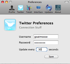
This thing is so small it doesn’t even have a menu bar at the top of the screen. It takes lightweight to the extreme. It uses Sparkle & Growl, hardly uses any RAM (obviously), and just sends and shows tweets.
That’s it. Literally. I wouldn’t worry about this one.
Pros:
-Lightweight, fast, uses basically no memory
Cons:
-Too basic for nearly everyone
Get it here: http://download.cnet.com/Tototl/3000-2150_4-10905637.html
DestroyTwitter
Price: Free
One more Adobe AIR-based platform like Twhirl and TweetDeck. Those who avoid AIR for its heavy memory consumption will already have no interest in this, but let’s take a look.
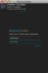
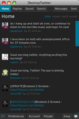
It boasts the common single-column arrangement. However, DestroyTwitter has a lot of hidden complexity and options. One big one is the profile display that happens when you click somebody’s icon. It goes through a sexy little animation to bring up their info, where you can follow/unfollow, message or tweet them, as well as see all their stats. DestroyTwitter shows a set number of tweets on-screen (20), but you can use the Older – Newer – Most Recent buttons to navigate through them. Hovering over a tweet presents the reply/message commands.
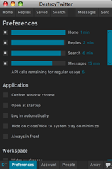
There are tons of preferences for this tool. You have control over your preferred refresh rates, and DestroyTwitter gives you assistance in choosing them, so you don’t go over the 100-call API limit. This is extremely helpful – and if you go over the limit, it’ll tell you the exact minute you can log back in. You can set DT to auto-login, adjust its themes and rules, select your preferred URL shortener, and change things like font size. There are plenty of resources at your authority.
It is a small program but the design makes it easy to read and navigate. Avatars get cached so the app doesn’t struggle to download them every time, and it remembers your search terms.
If you liked DestroyFlickr, you’ll probably like this. For sure, it’s one of the better AIR apps.
Pros:
-Great amount of features and settings
-Solid presentation, easy to navigate – the Jessica Alba of Twitter apps
Cons:
-AIR
-Doesn’t support multiple accounts
Get it here: http://www.techzilo.com/destroytwitter-twitter-client/
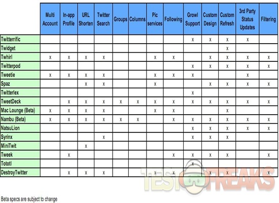
To give you a better comparison of all these programs, here’s a nice little chart we made up:
So which program will fit your Twitter needs the best? There are a lot of things to consider between the options, from aesthetics to ease of use, features, accessibility, and platform.
Maybe you’ll love them all, and you will have to host a romantic battle between applications for your tweeting affection.
Perhaps you’ll hate them all and stick with the web interface.
Either way, you certainly have plenty of options – and there’s no doubt more will continue to be developed as Twitter explodes with popularity.
There’s a good article here related to Twitter, and other social media services, that gives a nice comparison of URL Shortening Services: http://searchengineland.com/analysis-which-url-shortening-service-should-you-use-17204
And don’t forget we’re twittering now as well: http://twitter.com/technogog























21 comments for “Tweeting With Macs – 16 Twitter Clients Compared and Reviewed for OSX”