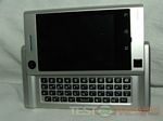
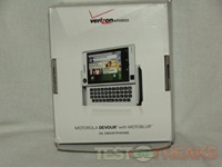
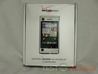
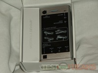
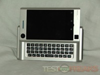
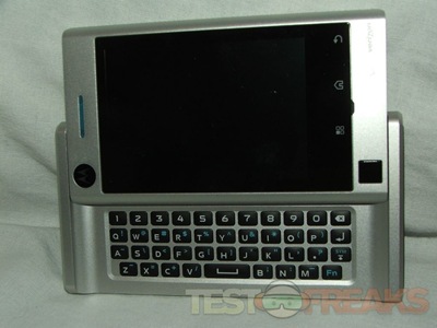
So I was eating my dinner and somebody rang my doorbell, it was a special delivery from our friends at Verizon Wireless. Yes I’ve got my hands on the new Motorola Devour, and I’ve been playing with it for a bit now so I’ve got the a bunch of pictures of the device and several of the interface for you as well. These will have to hold you off until I get my full review posted next week, I need to spend some quality time with it before I can really give you my full impressions. So far though I like it…
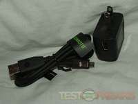
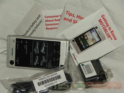
it comes with USB cable and AC adapter along with a bunch of literature:
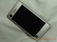
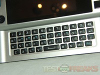
It is a sleek looking phone that feels nicely made, it’s got a bit of heft to it, I like that about it. It’s a slider with a full keyboard and a full row of numbers at the top, no pressing the function key for numbers.. yay!
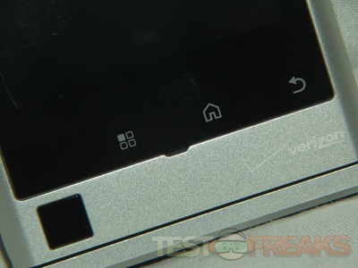
There’s even an optical trackball or mouse at the bottom below the touch icons
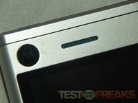
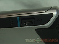
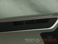
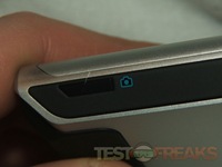
Speaker is at the top of course. On the left side is a visible USB port, while the right side has three buttons along with the camera button.
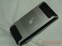
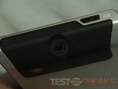
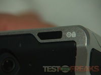
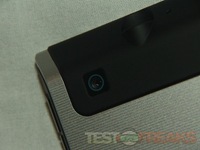
On the back is the camera, and towards the top is the audio jack and at the top edge is the power button.
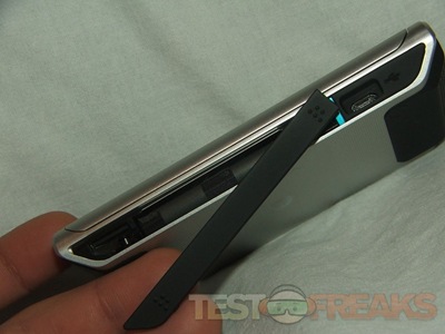
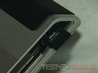
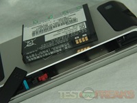
The left side where the USB port is has a sliding door that opens to reveal the battery and the 8gb microSD card.
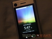
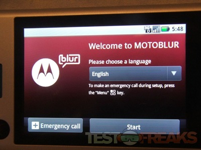
Starting up the phone you’re greeted with the Motorola Logo, then the Verizon Logo then you’re taken to the main screen where you’ll have to set up your phone to use it.
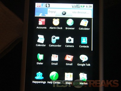
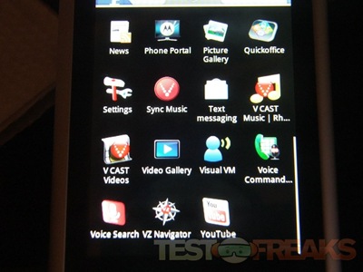
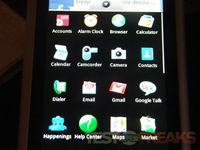
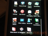
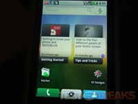
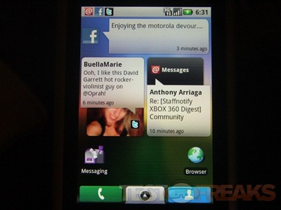
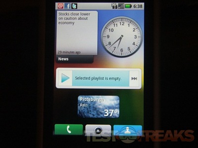
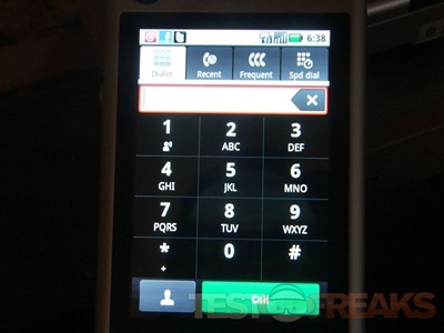
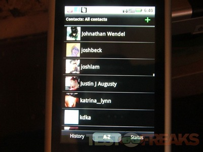
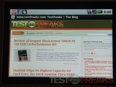
I set up a few things on the Devour, but haven’t played with it too much as the battery needed charging… But here’s a few screenshots for you:

