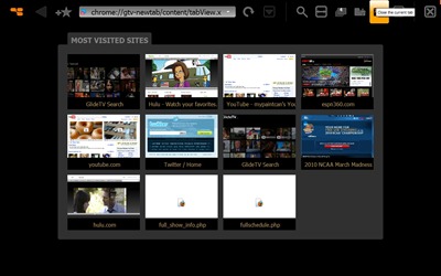
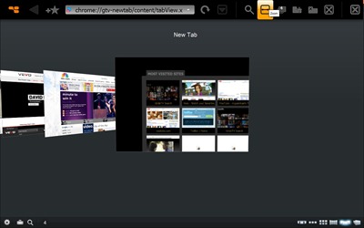
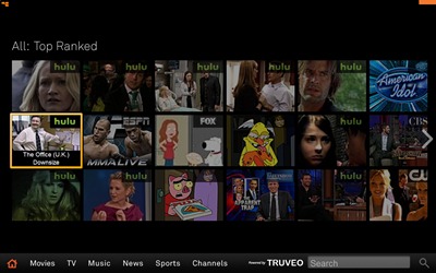
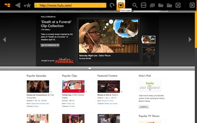
I took a look at the GlideTV Navigator back in November and I still use it with my HTPC to this day, I like it quite a bit as a basic interface for control of my HTPC for videos etc. They’re at DEMO Spring 2010 right now and they’ve just announced a new interface, while I don’t have it just yet, they’ve promised to let me get a peek at it, I do have some screen shots for you that they just sent me over.
Here’s a quick quote form the PR about it and screen shots to follow:
“One of GlideTV’s new software features is "What’s On," a TV friendly gallery of cover art that lets users instantly see what movies and videos are available across multiple sites in a single glance. With What’s On, users can browse the entire web by entertainment category and genre, rather than having to search for content one video site at a time. The new Navigator application is also multi-tasking, so users can watch a show and search for news about their favorite celebrity at the same time – or hop from YouTube to Hulu to Facebook, all while streaming Pandora in the background. The Navigator software features predictive search and type-ahead technologies that minimize input and provides quick zoom and touch scrolling, so even the longest web pages are easy to read. Aesthetically the GlideTV Navigator’s handheld wireless touchpad looks more like an object d’art than a remote, so it fits well in any living room. The Navigator’s wireless touchpad fits comfortably in the palm of a user’s hand, which they can rest in their lap instead of pointing at the screen, and navigate the entire web with just one thumb.”
I think I like the new interface, but won’t be sure until I get some time with it… I’ll grab my own screen shots for you and let you know how it is..


