Today for review I’ve got a phone from AT&T called the Motorola Backflip. This is the first Android phone from AT&T, and honestly it’s not the best example of Android out there. The Backflip is a clamshell or flip style phone, but it’s unlike any other out there, it flips backwards. The front of the phone is the screen and the back is the keyboard, the battery cover is actually inside of the phone when it’s closed. It’s a very interesting design that I’m still not sure I like very much. I do appreciate having the full keyboard, but keyboard is the back of the phone, not sure how well it will last being in your pocket or bag etc. The Backflip features the Moto Blur interface, and it works but not great. The phone is sluggish and fairly slow overall, it’s a bit underpowered to be honest, but call quality and battery life are very good. So read on to learn more about a rather unique Android phone…
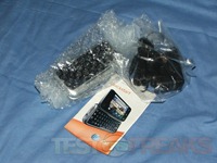
The phone I got didn’t come in a box, it came in a padded envelope actually so there’s really no box shots for you. Includes with it was the power supply and user manual.
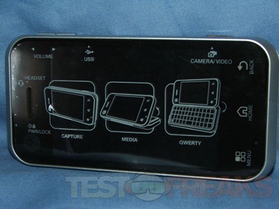
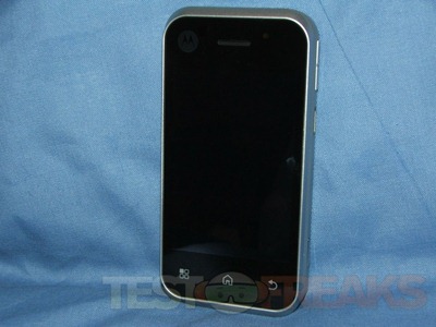
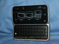
The phone comes with a clear cover on it that identifies the buttons, ports and features of the phone. Under the screen are three buttons for menu, home and back.
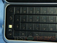
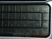
On the back is a nice full QWERY keyboard, but there’s no number line. I have to wonder why most AT&T phones are missing a number line and you have to press the ALT key to access them. The camera and flash are also in the keyboard which is essentially the back of the phone.
The Backflip is sort of a clamshell phone, an off style though. When closed the keyboard is the back of the phone, behind the screen is actually a touchpad for navigation.
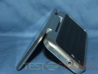
The hinge on the phone is stiff so it will stay at the angle you leave it.
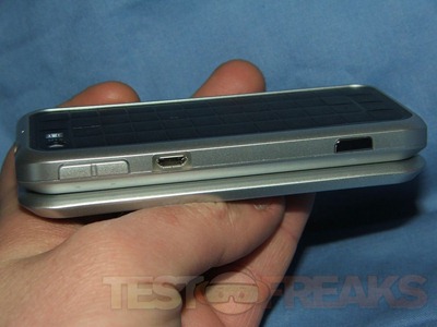
On the left side of the phone you’ll find the camera button, USB port and volume.
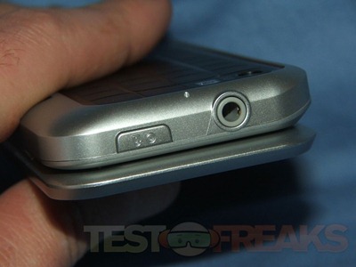
On the top you’ll find the audio jack and power button.
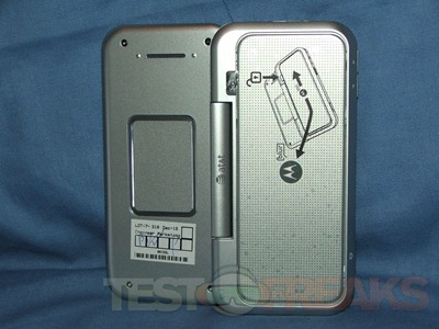
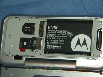
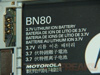
Removing the back cover you’ll find the battery, sim card slot and microSD slot.
Specifications:
PC-like web browsing
Best of the Web with full HTML web browsing on the nation’s fastest 3G network
Up to date contacts
Contacts, including status and pictures, auto-populate from social networks
Always-on Social Networking
Sync with Facebook, MySpace, and Twitter from home screen
Never-before-seen QWERTY flip design
Touch pad, touch display, and back-flip QWERTY with table top mode
Technical Specifications:
Battery:
Capacity: 1380 mAh
Talk time: Up to 6 hours
Standby time: Up to 13.5 days
Dimensions:
Weight: 4.7 ounces
Size (inches): 2.00 x 4.25 x 0.6 inches
Memory: Internal memory storage: 512 NAND, 256MB RAM
Expandable memory storage: 2GB up to 32GB
Memory format: microSD
Wireless Technology:
GSM/GPRS:GSM 850/900/1800/1900 MHz
3G: UMTS 850/1900/2100 MHz
EDGE high speed data network: HSDPA 7.2 Mbps (Category 7/8), EDGE Class 12, aGPS
BLUETOOTH technology: BT Class 2 Version 2.0
Operating System: Android
Display:
Display size: 3.1″ HVGA 256k TFT
Resolution (pixels): 480 x 320
Colors: 256k
Keyboard:
Touchscreen
QWERTY
Predictive text for fast typing
Backlit Keys
Camera:
Resolution: 5.0 megapixels
Zoom: 4X
Live video capture and playback
Pricing:
No Commitment Pricing: $349.99
2-yr Contract Price: $199.99
Motorola Backflip at Motorola.com
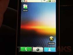
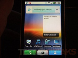
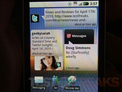
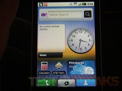
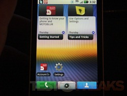
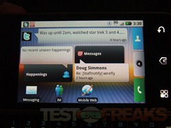
Let’s start with the interface. It’s several home screens that you can scroll through with left and right finger swipes. I didn’t change anything around, the way it is set up in the pictures is the way it comes. The order is basically left to right with the main screen being the one with Twitter on it. I tossed the landscape view in there as well along with the boot screen. You’ll have to do a lot of scrolling back and forth to access the things you want to.
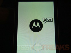
I posted that boot screen up there for a reason, you’ll see a lot of it, boot time for this phone is quite long and on boot up things are very slow to get started. I put my sim pin in and it’s like things are going in slow motion and the phone seems unresponsive for the first 10 to 15 seconds seconds. I timed the boot up and it takes about 1 minute and 44 seconds to get to the main screen and have everything loaded, updated and the phone actually ready to use with it being responsive. That time includes putting the sim unlock code in as well.
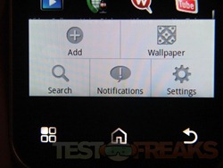
There are a few buttons at the bottom below the screen Menu, Home and Back. Hitting the menu button pops open the quick menu with access to a few basic settings.
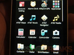
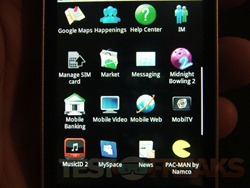
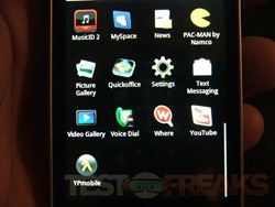
Here’s the apps that are installed with the phone:
In regards to what’s installed as we’ve come to expect there’s a lot of AT&T junk on there and trial software and games. They put the stuff there to make money, but who really wants Pacman or Midnight Bowling 2?
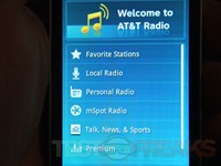
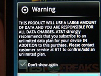
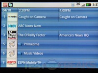
Then of course you’ve got many things that are trial software like AllSport GPS, AT&T Navigator, AT&T Radio, MobiTV, and Where. The Mobile Backing app like a 10 page EULA, and I don’t know what the point of it is really, I’m not sure I would want my banking information on my phone. Sure I carry it with me everywhere, but if I lose it I’ll be in trouble. As far as AT&T radio is concerned, why couldn’t they just put an FM tuner in the phone?
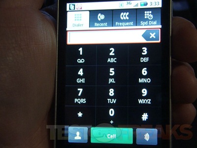
Making calls with the Backflip is fine, call quality is very good. I’ve been with AT&T for many years, and the main reason is that I can get a phone call in my house, so reception for me is fine, and that includes data/web browsing etc. The dialer is nice and big, and takes up most of the screen.
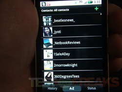
The phone pulled all of my contacts from Twitter, Facebook and Google, there’s way too many there but you can sort them.
I used the Bluetooth with no issues, it paired with my Jawbone2 fine and again call quality was good.
The battery life seems good, I easily got the rated 6 hours of talk time, a little less when I was browsing etc, but that’s to be expected.
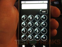
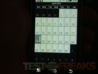
There is a nice big calculator and the calendar is nice as well.
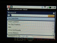
YouTube is included, and of course you’ve got regular web browsing. The thing is though that they’ve got rid of Google and replaced it with Yahoo and I have to ask why?!
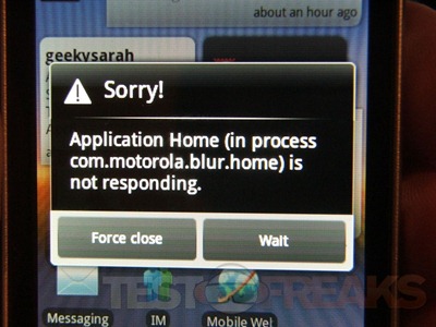
One of the big problems with this phone is that is crashes quite often, or Motoblur does.
The next big issue with this phone is that it’s slow and sluggish overall. For example when you’re swiping left or right there’s a about a second delay between the swipe and when it moves, it’s even longer when you wake the phone up for it to respond.
Another small annoyance is that it it switches from landscape to portrait mode for no apparent reason, and then at times it won’t switch at all when you want it to.
Picture quality is actually decent, though you’ve got to hold the phone very still. The options are very limited, and there’s no Macros mode but close-up pictures come out very good. Here’s just a few examples:
Conclusion:
The Motorola Backflip is a unique and interesting phone for sure, but there are much better examples of Android out there today. The phone is running Android 1.5, and supposedly it’s upgradable, but I haven’t seen it happen yet.
The phone is slow and sluggish, and just underpowered overall. It feels like it can’t really run the interface, there’s a lot of lag and I experienced many crashes of Moto Blur, which is supposedly a selling point of the phone.
There’s a ton of crapware on the phone from AT&T, when will they learn that we don’t want this junk on our phones?! At the very least they could let us uninstall or delete it from the phone.
It’s Android and there’s no Google, that makes no sense to me.
On the plus die of things though the battery life is vey good as is the call quality and it takes decent pictures, but that’s not enough to make a good smartphone.
Pros:
+Seems well made
+Interesting design
+Android on AT&T
+Decent call quality
+Good battery life
+Nice big keyboard
Cons:
-Crashes/Errors often for some reason
-Odd backflip style
-Yahoo search?!
-AT&T junk installed
-Rather slow overall
| Grades: | |
| Overall |  |
| Design |  |
| Performance |  |
To learn more about our review policy please visit this page HERE.









13 comments for “Review of AT&T Motorola Backflip”