Things from Cultured Code is one of the first programs that I install on all my Macs. This task management software helps organize my busy and somewhat hectic life. If you keep a “To Do” list on you all the time then Things is a program worth owning, especially used in conjunction with an iPhone/iPod Touch or now the iPad. For more information about Things for Mac please check out my review from last year.
Today I’ll be looking at the iPad app iteration of Things. This version is designed to take advantage of the iPad’s strengths such as larger screen real estate and capacitive interaction. Its user interface is very reminiscent to the OS X version. Things for iPad can be used in isolation or in conjunction with the Mac version. Personally, I think using Things with both the iPad and Mac provides the best user experience.
Specifications:
Things is a beautifully focused and amazingly intuitive task manager. Other todo applications either oversimplify or are too difficult to use. Things instead offers the perfect balance between ease of use and powerful features.
Price: $19.99
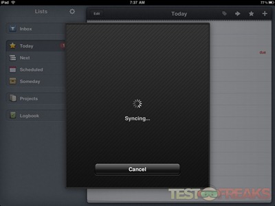
Data is easily synced between the OS X and iPad versions. Simply have Things running on your Mac and run Things on the iPad and the two will automatically share and sync their data.
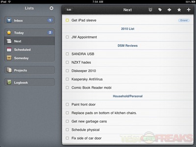
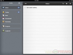
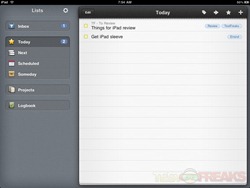
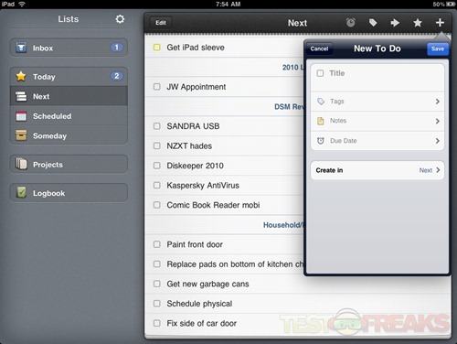
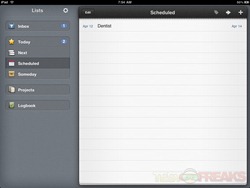
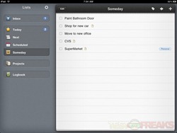
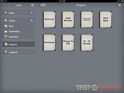
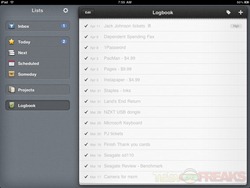
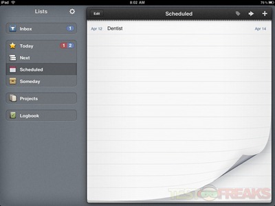
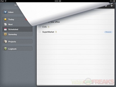
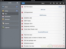
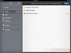
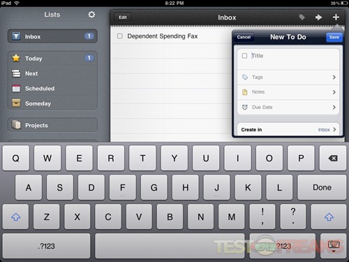
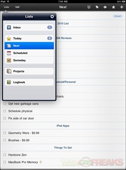
Things for iPad works in either portrait or landscape mode but is more functional and Mac like when running in landscape. In the latter view there are two sets of columns. The one on the left side is comprised of list categories – Inbox, Today, Next, Scheduled, Someday, Projects and Logbook. The right side of the screen provides detailed information for these list categories.
When switching between list pages there is a nice page flip graphic similar to the one seen in the iBooks app. This is more eye candy than a useful feature but is still cool to see in action.
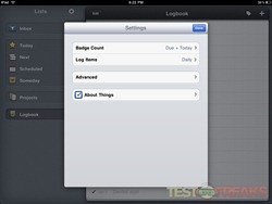
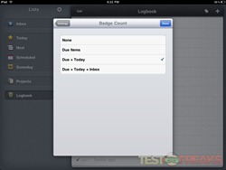
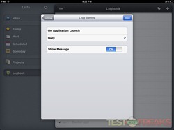
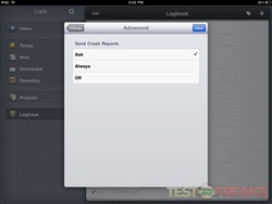
Settings can be adjusted from the cog icon seen to the right of the List label when the screen is in landscape view. From here the user can control the Badge count, ability to Log Items, Advanced Settings that basically indicates whether you are willing to send crash reports and an About Things section.
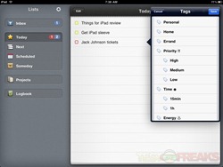
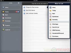
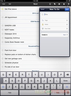
On the right side of the screen above the list section is an Edit button that allows bulk deletion of items and towards the right of the List label are Tag, Move, Star, and New To Do icons. Tagging items is especially helpful when trying to sort your tasks.
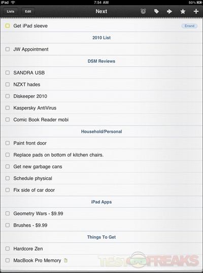
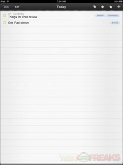
Flipping the iPad to portrait mode causes Things to mimic the function of the iPad’s Mail app with the information normally found in the landscape’s right screen taking up the entire display. A drop down list is used to show the List categories.
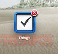
Badge counts such as the ones found with the email and App Store apps appear on the Things main screen icon to indicate any impending items that need to be addressed.
For more in depth descriptions of Things capabilities please check out my previous review.
Conclusion:
If you plan to carry your iPad around all the time and need to keep track of your projects and To Dos, then Things for iPad is an essential app to own. Feature wise is it almost identical to the Mac version and syncing data with the desktop version is easily accomplished without much user intervention. There are really no complaints about Things for iPad other than the price. It is one of the more expensive apps in iTunes and the iPad version does not work with the iPhone/iPod Touch. Cultured Code should either lower Things for iPad’s price or make this a “universal app” to gain a larger user base. Not a major issue but it may be something that keeps some people from investing in the app.
I know Things for the iPad will be residing on my Apple tablet for quite some time. Now please excuse me I have to check off my Things for iPad review task.
Pros:
+Easily Manage your To Dos and Projects
+Tag your tasks for easy sorting
+Syncs between OS X Things version
Cons:
-One of the more expensive apps
| Grades: | |
| Overall |  |
| Design |  |
| Performance |  |
To learn more about our review policy please visit this page HERE.



5 comments for “Review of Things for iPad”