Today for review I’ve got another phone from Verizon Wireless the Motorola Devour. It’s an Android based phone that could be called the little brother to the Droid, it’s similar to the Droid in many ways but it can stand on its own. The Devour is a phone that I like quite a bit, it’s heavy and well made, but it’s one for those that are really into the social networking scene. The Devour is a slider style phone with a full QWERTY keyboard with full numbers as well, so no hitting the function button to use them. In my time with the Devour I’ve found it to be a very good phone overall, it works well, it’s finger friendly and it’s nice and fast. I did run into a few small issues with it though, the camera is not that good, and I didn’t get the rated battery life along with rather slow web access…
No video for you today…
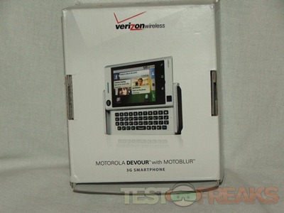
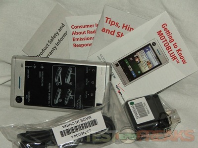
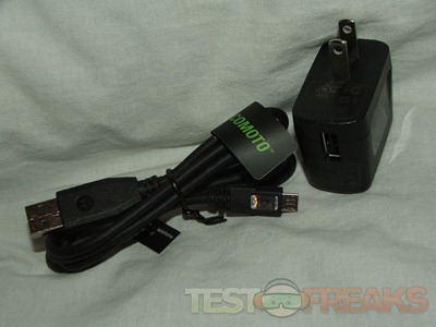
The Devour comes with USB cable, USB AC adapter and the literature.
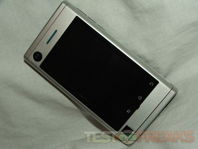
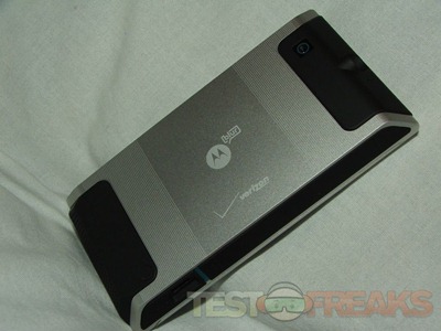
The Devour is a well made phone, it’s made of aluminum and plastic and it’s a heavy phone. I like the black and silver color combination though.
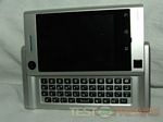
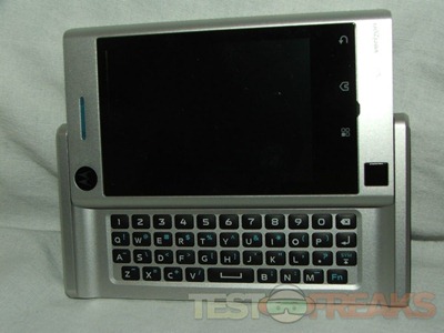
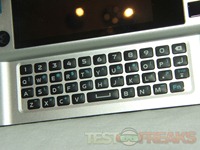
It’s a slider phone with a full QWERTY keyboard with number line across the top.
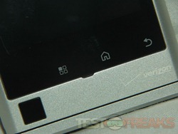
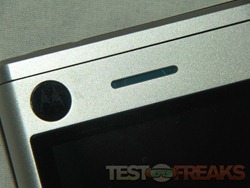
The bottom of the front features an optical track pad and three touch sensitive buttons beneath the display, above the screen is the speaker and the Motorola logo.
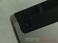
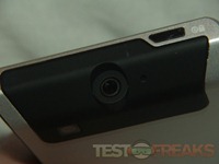
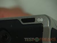
On the back you’ll find the camera near the top where you’ll also find the power/lock button on the top edge and the 3.5mm audio jack in the center.
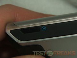
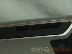
On the right side you’ll find for buttons for camera and volume etc.
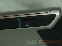
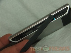
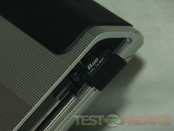
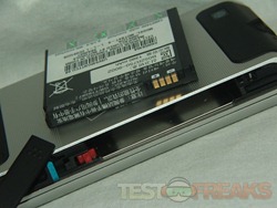
On the left side you’ll find the mini-usb port and a door actually that reveal the battery and the microSD slot, the Devour comes with an 8gb card.
Specifications:
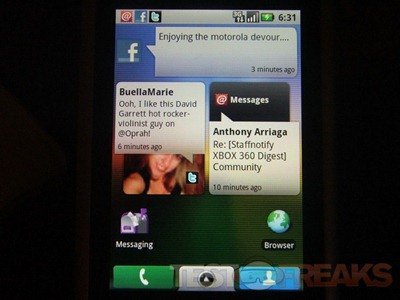
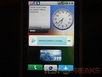
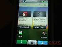
Do your messages, posts, pics and tweets with MOTOBLUR. It gathers them all directly onto DEVOUR’s customizable home screens, instantly and automatically. Organize them how you want, update them when you want, and access everything instantly on the 3.1” touch screen.
DISPLAY TYPE: 65k TFT
COLORS: Silver with black accents
MATERIALS AND FINISH: Extruded aluminum design
WEIGHT: 5.89 oz.; 180 grams
SIZE (H X W X D): 61.0 x 115.5 x 15.4 mm
DISPLAY SIZE: 3.1-in.; HVGA (320 x 480 pixels)
CAMERA
MEGAPIXELS: 3 MP
DIGITAL ZOOM: Continuous
FOCUS: Fixed
IMAGE EDITING TOOLS: Cropping, rotating, Geo Tagging <
Power:
up to 389 min.
USAGE TIME
BATTERY TYPE: 1400 mAh Li Ion
STANDBY TIME: up to 443 hrs.
MEMORY:8 GB microSD pre-installed
ACCELEROMETER: Yes
NETWORKS: CDMA 800/1900 EVDO rev A
REMOVABLE MEMORY: supports up to 32 GB microSD
VERIZON WIRELESS:
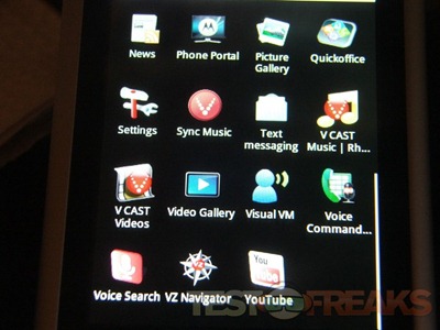
V CAST Music with Rhapsody, Visual Voice Mail, V CAST Video, VZ Navigator
WEB BROWSER: Android HTML Webkit with Adobe Flash Lite
BLUETOOTH® TECHNOLOGY: Stereo Bluetooth technology, Class 2 + EDR (supports profiles A2DP, HSP, HFP)
WIFI: 802.11 b,g
DATA TRANSMISSION RATE: USB 2.0 High speed
DATA ACCESS: Yes
CONNECTOR TYPE: Micro USB
Turing on the phone is simple as pushing the power button, but that button is basically flush with the phone and I’m not sure I like that. It’s nice in that you can’t accidentally push it, but you really have to feel for it and push down rather hard to get it to function. If it was just a little more raised it would be better to be able to feel it without looking.
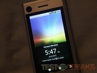
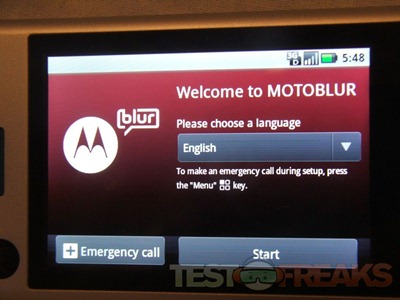
When you turn it on for the first time you’ll need to get it all set up, it’s easy and take a few minutes.
The Devour is a nice heavy phone, some people might not like that but I do personally. I like phone with some weight to it and the Devour is heavier than most phones out there today, it’s a personal preference thing really. It is well made, I really do like the look, feel and design of it.
Compared to the actual size of the phone the display is rather small, there is a lot of space on both sides of the display, they could have easily put in a larger sized screen I would think. It’s 3.1 inches which works really, but it just seems there’s a lot of wasted space. The screen also isn’t centered in the phone, there’s about 1 inch of space on the right and only about 1/2” on the left. This isn’t a big deal until you open the phone though and turn it sideways, since the screen is small they should have centered it. The screen though is nice and bright and the colors are crisp and clear.
The keyboard is nice especially the having the number keys right there in the top row, I’m so accustomed to hitting the function key to use the number that it took me a while to not do it with the Devour, but now though since I’m back to my phone I really miss having the number keys right there for you. The three touch buttons below the screen are nice as well, having Home and Back right there for you do make things quicker and easier. I did ask my contact at Verizon about the Devour being updated to the new version of Android, but sadly as of now I have not heard back yet.
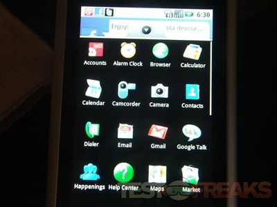
The optical mouse is ok, but I much prefer just using my fingers on the screen for navigation, I used it a few times then really forgot it was there. Navigation via the screen is quick and the phone is very responsive overall, everything opened quickly with no issues, no lag or anything like that. The interface is finger friendly as one might expect.
The Devour is a phone really for those into social networking, I do it yes, but it’s not an obsession with me, my phone is for making phone calls, checking email and maybe doing a bit of web browsing if need be. To really get the most from this phone you need to be into all of that stuff, it works well though.
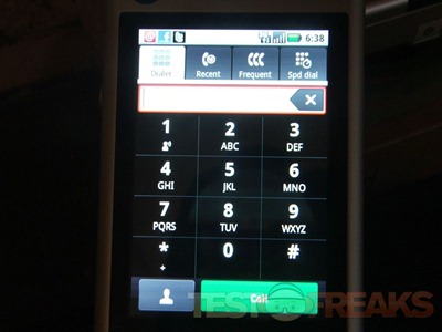
Making calls with the Devour is easy, I like the fact that the dialer button is most always on the screen for instant access. The dialer itself is nice and large and finger friendly.
The call quality is very good, it’s nice and clear and the volume can get nice and loud which I like. I also used it with my Jawbone2 and had no issues pairing or re-pairing with the Devour. The people I talked to reported no issues with hearing me and I didn’t have any hearing them.
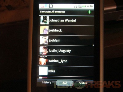
The contacts are nice in a way, but the phone can pull all of you contacts from you Twitter and Facebook accounts meaning you could end with hundreds of them with no numbers etc attached to them. I like my contacts to be just my contacts or people that I call.
I did run across a major problem with the battery life, I got nowhere near the rated time. I didn’t use this phone that much, but yet I still had to charge it at least every other day. I made a few calls here and there and updated my Facebook account and Twitter accounts a few times to test it out and I did some web browsing. I also explored the phone etc, but nothing really battery intensive. In fact I just let it sit for a few days and didn’t even use it at all and the battery still died within two days. It could be because this was a review sample, but I would think Verizon would send me a ‘real’ phone to review, but who knows…
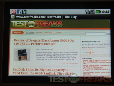
Speaking of web browsing, web pages look great on the Devour, but it’s really slow and it might not be the phone itself, it could be the network here in Pittsburgh, but every time I played with it it just took a long time to do much of anything. By long time I mean minutes to get something to load and not just a few extra seconds here and there, some things did load fast, but most others literally took 2-3 minutes to load. I’m guessing the network was busy as when I used it, with my Wi-Fi it seemed much faster.
I don’t have any sample pictures for you this time, the camera is a cell phone camera and as you might expect not that great. Pictures taken outside in bright light are nice, if a bit washed out, but those inside are generally dark and usually blurry as you really need to hold the phone still to take a good picture. It’s also a fixed focus camera so you’re stuck with what you get, no macro etc. The Devour does feature cropping, rotating and geo tagging. Yes there is a video camera mode, but it’s not that great, I have yet to really find a phone that does have a good camera built in.
Conclusion:
The Motorola Devour is great phone overall truly, it’s easy to use, it’s quick and it’s finger friendly. The build quality is very good, it’s a nice heavy phone, though some people might not like that, if you’re looking for a lightweight phone this isn’t it.
How does it hold up the Droid or the Eris? Well honestly I would prefer the Droid over the Devour and the Eris, I do like the Devour better than the Eris though. To me the Eris is just too small and lightweight, but that’s a personal preference. All of these phones are priced similar, and what it comes down to is what you want from your phone really. If you’re really into the whole social networking thing then you might want to grab the Devour, it’s a well made phone that’s easy to use.
Pros:
+Nice, heavy well made phone
+Good call quality
+Easy to use
+Finger friendly interface
+Great for social networking
Cons:
-Poor picture quality
-Poor battery life
-Slow web browsing (*could be network in my area)
| Grades: | |
| Overall |  |
| Design |  |
| Performance |  |
This product was given to technogog for review by the company for review purposes only, and is not considered by us as payment for the review, we do not, and never will, accept payment from companies to review their products. To learn more about our review policy please visit this page HERE.




13 comments for “Review of Verizon Wireless Motorola Devour”