Usage and Interface
There’s a lot to cover here so I’m breaking this up into a couple or few pages. This page is mostly the default tablet screens and settings, the next page will be more about actually using it.
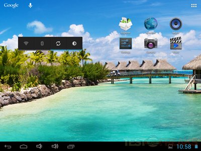
When I first turned the tablet on I was greeted with the welcome screen,
Once past that you’ll see a few icons and the control bar there for you. The Explorer icon is just a basic file explorer, and the others are rather self-explanatory like Browser, Settings, Camera and Music.
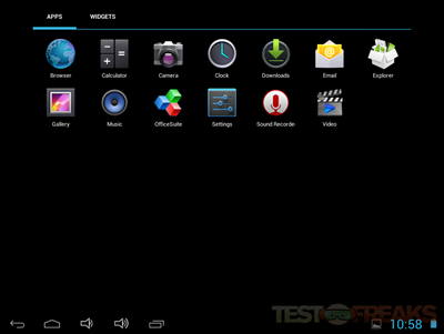
The first thing I wanted to see was what was installed on the tablet so off to the Apps page we go.
As far as apps are concerned it’s rather sparse, but they do include the basics and Office Suite 7 but it’s the free version and you can only view documents with it.
Yes there isn’t much there, but I can say it’s nice to not see a bunch of junk I’ll never use and free trial stuff installed. Sometimes less is better.
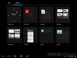
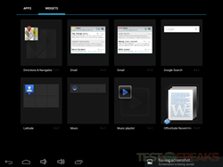
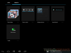
Then of course there’s the Widgets you can use on the front page, these again are rather self-explanatory. If you’ve ever used Android then you know what they are, but for the uninitiated Widgets are essentially shortcuts that go on the home screens which can be active.
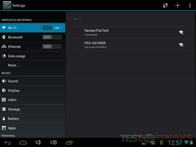
So let’s check out the Settings. First off you’ll see data and connections. Wif-fi, Bluetooth, Ethernet etc.
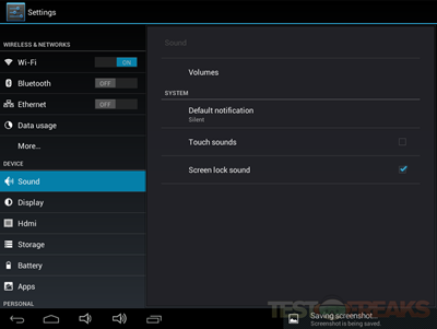
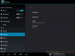
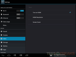
Then there’s options for Sounds, Display and HDMI. Not much special really, but you can turn HDMI on and off.
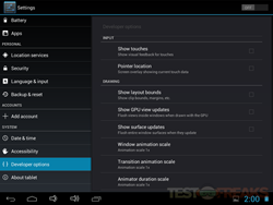
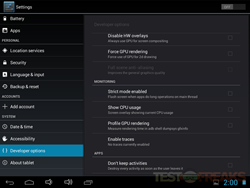
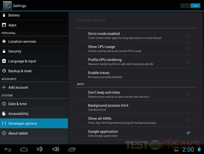
One of the more interesting things you’ll find in the Settings is Developer options and there’s a lot of them. I should note that when I turned the table on first there were no Google apps anywhere to be found, I had to go into Developer Options and Un check ‘Hide Google Applications’.
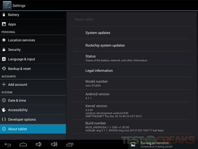
Here’s the About page where you’ll find information about the tablet. You’ll see it’s running Android 4.1.1.
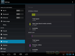
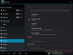
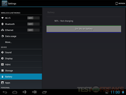
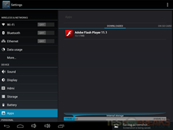
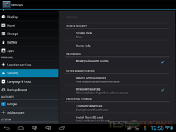
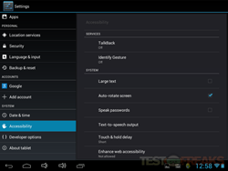
Here’s some other screenshots from the settings for you, battery, apps, and storage.



6 comments for “Review of Idolian Mini Studio 8” Android Tablet”